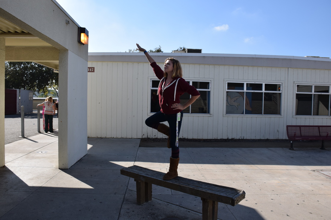
 Balance, shutter speed 1/1250 of a second, aperture f/8, ISO 400 A) This photo is of Kelsey doing a yoga pose on a bench. B) The principle of balance is shown through Kelsey in this photograph. C) The photograph is successful because it shows a visual sense of stability. 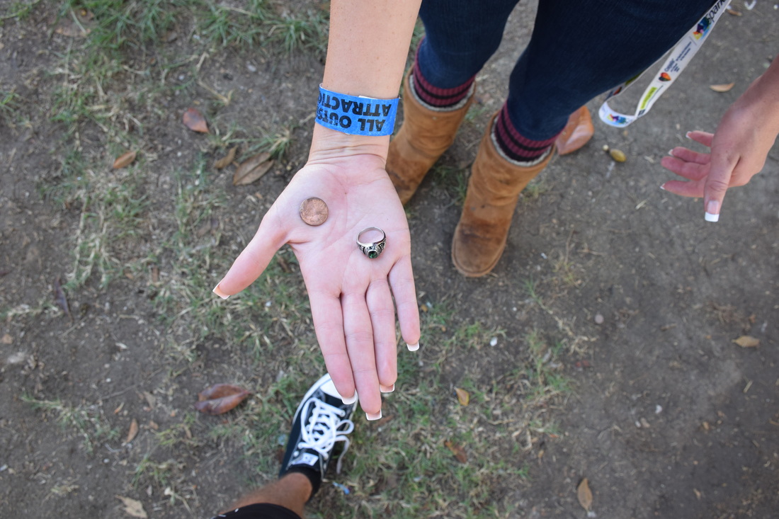 A) This photo is of a ring next to a penny on someone's hand. B) The principle of proportion is shown through the objects in this photograph. C) This photograph is successful because it shows the relationship between the object's relative size through scale. 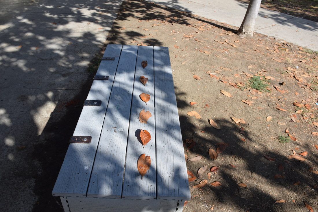 Rhythm, shutter speed 1/640 of a second, aperture f/8, ISO 400 A) This photo is of a bunch of leaves lined up on a bench. B) The principle of rhythm is shown through the leaves in this photograph. C) This photograph is successful because it indicates movement by the repetition of elements. 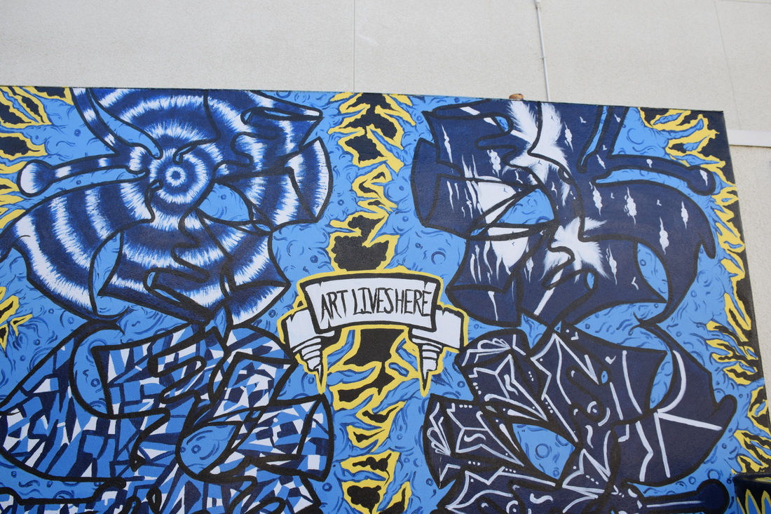 Emphasis, shutter speed 1/400 of a second, aperture f/8, ISO 400 A) This photo is of a mural at Rancho Buena Vista. B) The principle of emphasis is shown through the mural in this photograph. C) This photograph is successful because the intense colors attracts the viewer's eyes. 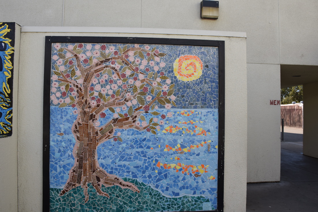 Harmony, shutter speed 1/500 of a second, aperture f/8, ISO 400 A) This photo is of another mural at Rancho Buena Vista. B) The principle of harmony is shown through the artwork in this photograph. C) This photograph is successful because it has different elements of a composition interacting to form a whole. 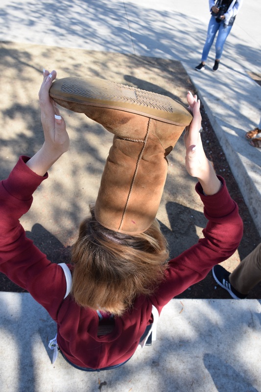 Variety, shutter speed 1/400 of a second, aperture f/8, ISO 400 A) This photo is of Kelsey holding a boot on her head. B) The principle of variety is shown through the boot on her head in this photograph. C) This photograph is successful because of the difference achieved through opposing elements in a composition to add individualism. 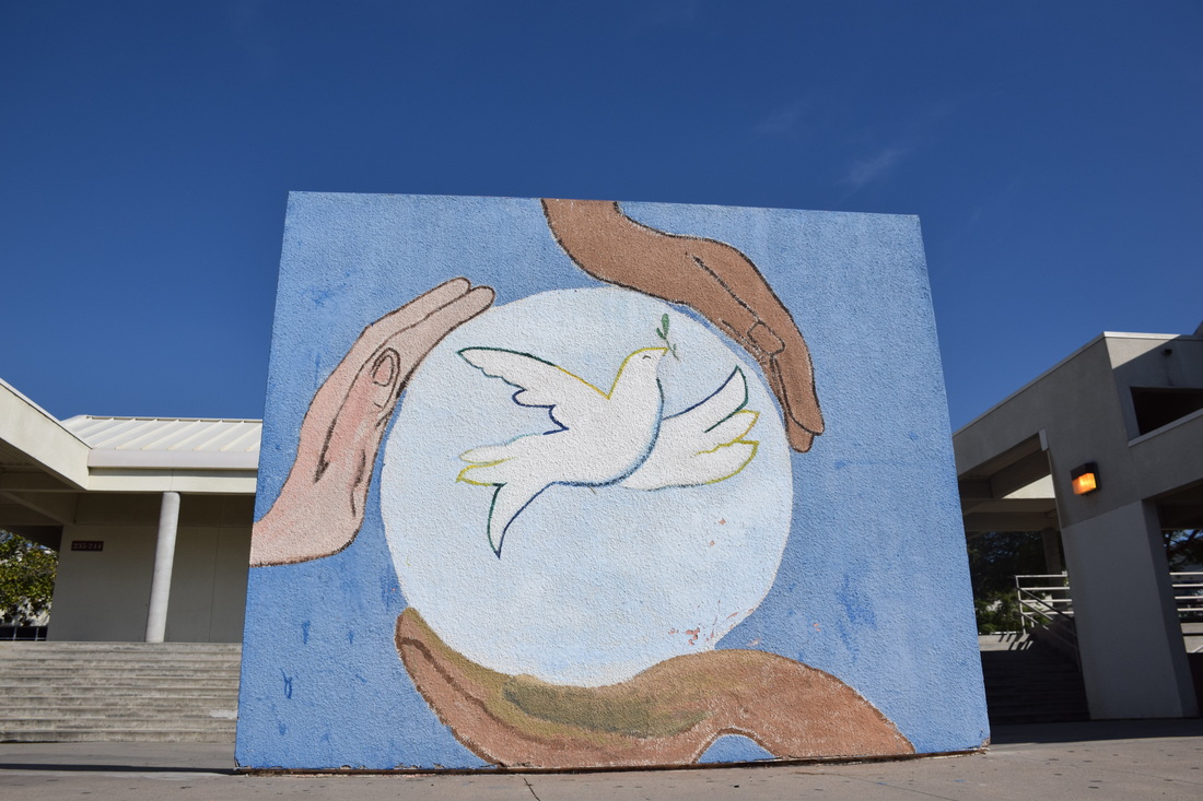 Unity, shutter speed 1/2500 of a second, aperture f/8, ISO 400 A) This photo is of a mural at Rancho Buena Vista.
B) The principle of unity is shown through the mural in this photograph. C) This photograph is successful because it achieves a sense of oneness.
0 Comments
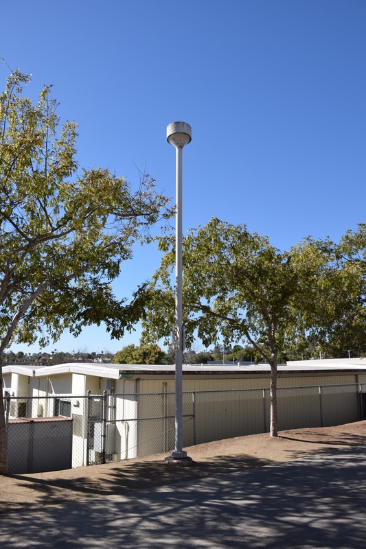 Line, shutter Speed 1/1000 of a second, aperture f/8, ISO 400 A) This photo is of a light pole at Rancho Buena Vista. B) The pole in the photograph represents the element line. C) The photograph is successful because the pole has a straight rigid structure. 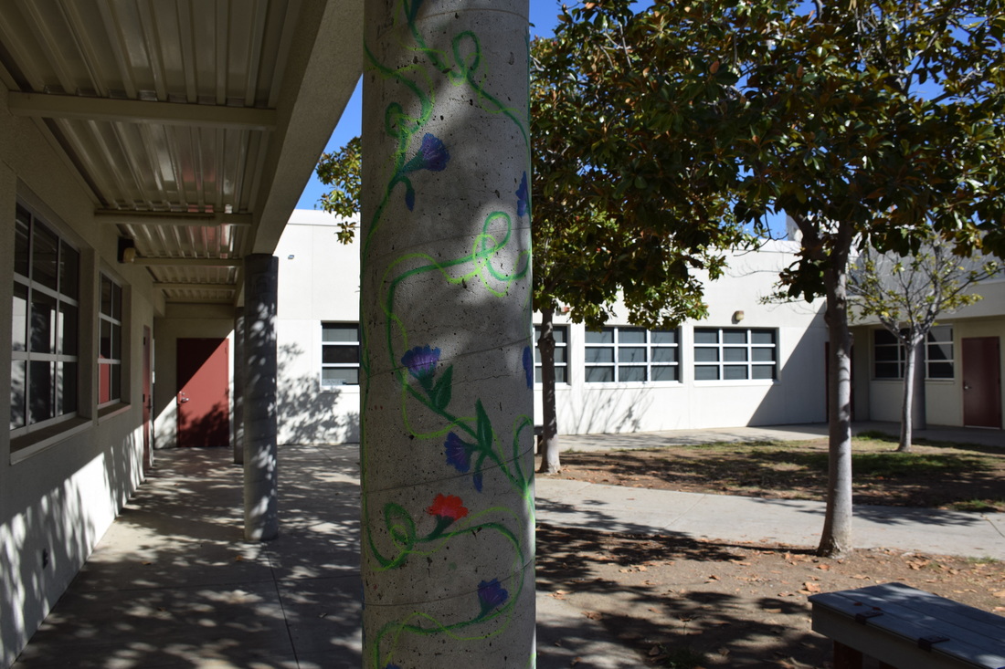 Color, shutter speed 1/1000 of a second, aperture f/8, ISO 400 A) The photo is of a column at Rancho Buena Vista. B) The colorful design on the pole represents the color. C) This photograph is successful because it contains all three characteristics of color: hue, value, and intensity. 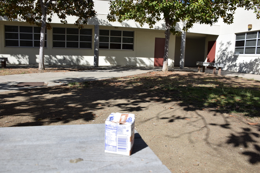 Form, shutter speed 1/1250 of a second, aperture f/8, ISO 400 A) This photo is of a milk carton on a bench. B) The milk carton in the photograph represents form. C) This photograph is successful because the milk carton is three dimensional. 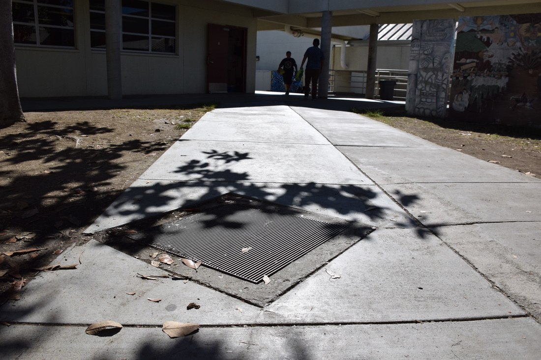 Shape, shutter speed 1/2000 of a second, aperture f/8, ISO 400 A) This photo is of a sewer grate at Rancho Buena Vista. B) The sewer grate in the photograph represents shape. C) This photograph is successful because the square is two dimensional. 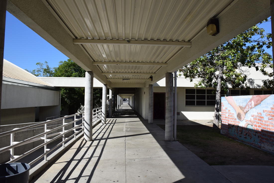 Space, shutter speed 1/1000 of a second, aperture f/8, ISO 400 A) This photo is of the empty hallway at Rancho Buena Vista. B) The emptiness of the hallway represents space. C) This photograph is successful because it gives you a feeling of depth. 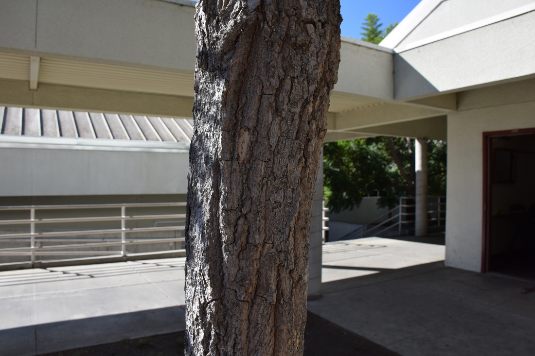 Texture, shutter speed 1/800 of a second, aperture f/8, ISO 400 A) This photo is of a tree at Rancho Buena Vista. B) The trunk of the tree represents texture. C) This photograph is successful because it gives you a visual sense of how the bark would feel. 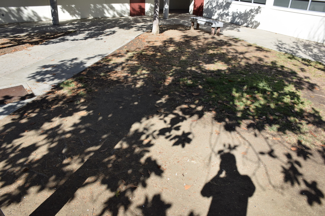 Value, shutter speed 1/800 of a second, aperture f/8, ISO 400 A) This photo is of the shadow of a tree and the photographer.
B) The shadows in the photo represent value. C) This photograph is successful because it shows the lightness and darkness of the surface. The building block of design All good design will have one or more of these elements; line, shape, form, texture, space, and value This presentation aims to show you some illustrations of these elements through photography It could also be done through other art methods, such as painting, fashion design, sculpture, etc. A line is one-dimensional and can vary in width, direction, and length Lines also can define the edges of a form Lines can be horizontal, vertical, or diagonal, straight or curved, thick or thin Lines lead your eye around the composition Color has three main characteristics: hue (red, yellow, green), value (how light or dark it is), and intensity (how bright or dull it is) Colors can also be described as warm (red, yellow) or cool (blue, green) Furthermore, monochromatic- one color plus its tints (adding white) and shades (adding black) Complimentary colors- colors opposite each other on the color wheel (green & red) Analogous colors- colors next to each other on the color wheel (red & orange) Shape is two dimensional, with a height and width Organic shape: a shape made by nature (not completely defined) Inorganic shape: manmade- such as triangles and rectangles Form is three dimensional, has height and width and depth Photographers emphasize form by the use of highlights and shadows The surface quality of an object that we sense through touch All objects have a physical texture (think- horsehair, dolphin smooth) In a two dimensional work, texture gives a visual sense of how an object depicted would feel in real life if touched Real space is three dimensional Space in a work of art refers to a feeling of depth or three dimensions It can also refer to an artist’s use of the area around the picture plane Positive space- the space occupied by the primary object Negative space- the space around the primary object Value is the lightness or darkness of a surface It is frequently used when talking about shading, but is also important in the study of color The principles of art are the rules or guidelines of art Used to organize or arrange the structural elements of design Principles are balance, proportion, rhythm, emphasis, harmony, variety, and unity Balance is similar to our physical sense of balance It is how the artist uses opposing forces in a composition that results in visual stability Most successful compositions achieve balance in one of two ways: symmetrically (the same on both sides, like a butterfly wing) or asymmetrically Proportion relates to the relative size and scale of the various elements in a design Specifically, the relationship between the objects Rhythm in an artwork indicates movement by the repetition of elements Rhythm can make an artwork seem active Emphasis is to make one part of an artwork dominant over the other parts It attracts the viewer’s eyes to a place of special importance in an artwork Harmony is the pleasing quality achieved by different elements of a composition interacting to form a whole Harmony is often accomplished through repetition of the same or similar characteristics Variety is the differences achieved by opposing, contrasting, changing, elaborating, or diversifying elements in a composition to add individualism and interest Unity is the result of bringing the elements of art into the appropriate ratio between harmony and variety to achieve a sense of oneness It is the sense that everything works together and looks like it fits 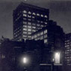 Alfred Stieglitz "From the Back Window at 291" 1915, theartstory.org. This picture uses lines to define the edges of a building and its windows. This is effective because it clearly outlines the building in the city night. 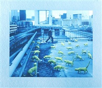 Sandy Skoglund "Cats in Paris" 1993, artnet.com. This picture can be described as using cool colors since she uses both blue and green in the image.  Laszlo Moholy "Bauhausbucher 8" 1927, theartstory.org. Since all the figures in the picture are two dimensional they are considered to be shapes. 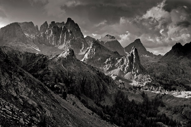 Ansel Adams "The Mountains That Made the Man" 1916, nationalgeographic.com. By using shadows and highlights the photographer is able to effectively emphasize form. 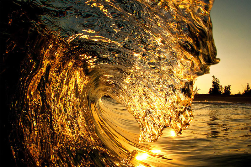 Clark Little "Bling" 2016, clarklittlephotography.com. This picture makes us feel that the water is extremely smooth and clear. 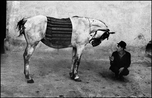 Joseph Koudelka "Gitans" 1975, magnumphotos.com. The positive space in this picture is the horse and man whereas the negative space in this picture is all the empty space around the two of them. 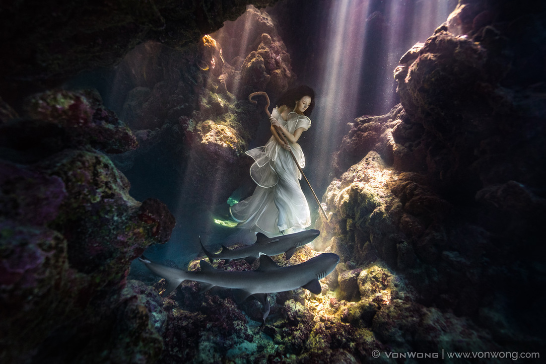 Ben Von Wong "Deliverance" 2014, vonwong.com. This picture shows value because of the lightness and darkness on the surface of the image. 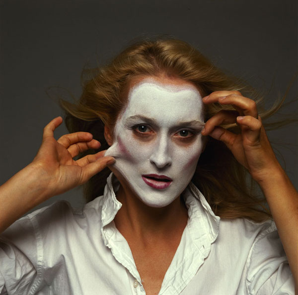 Annie Leibovitz "Meryl Streep" 2007, pbs.org. This picture achieves balance through symmetry because her hands are doing the same thing on both sides. 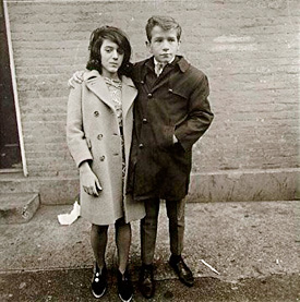 Diane Arbus "American Suburb" 1953, metmuseum.org. This picture demonstrates proportions by using two different people that you could use as reference to size. 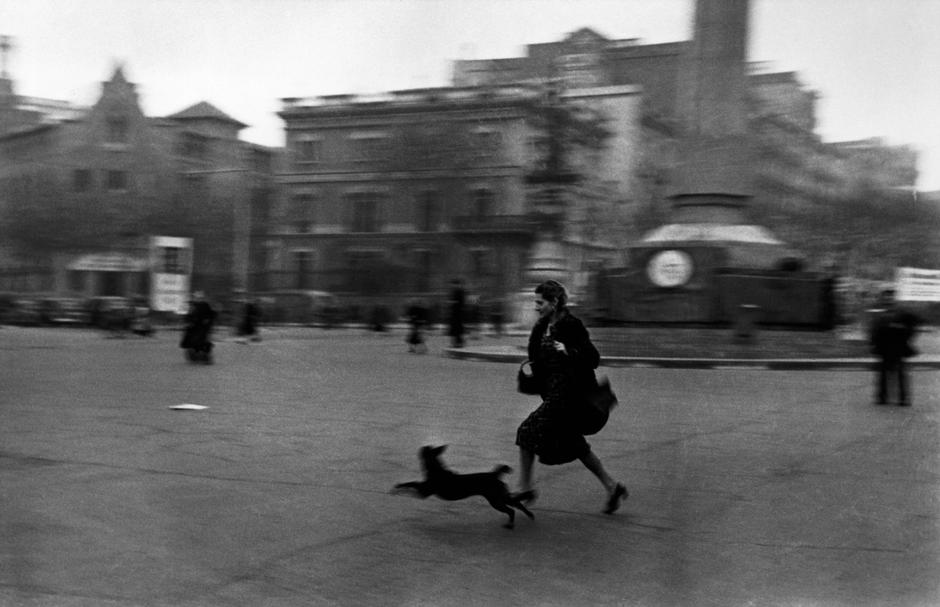 Robert Capa "Running for Shelter" 1936, magnumphotos.com. This picture shows rhythm because of the movement of the dog and the lady running. 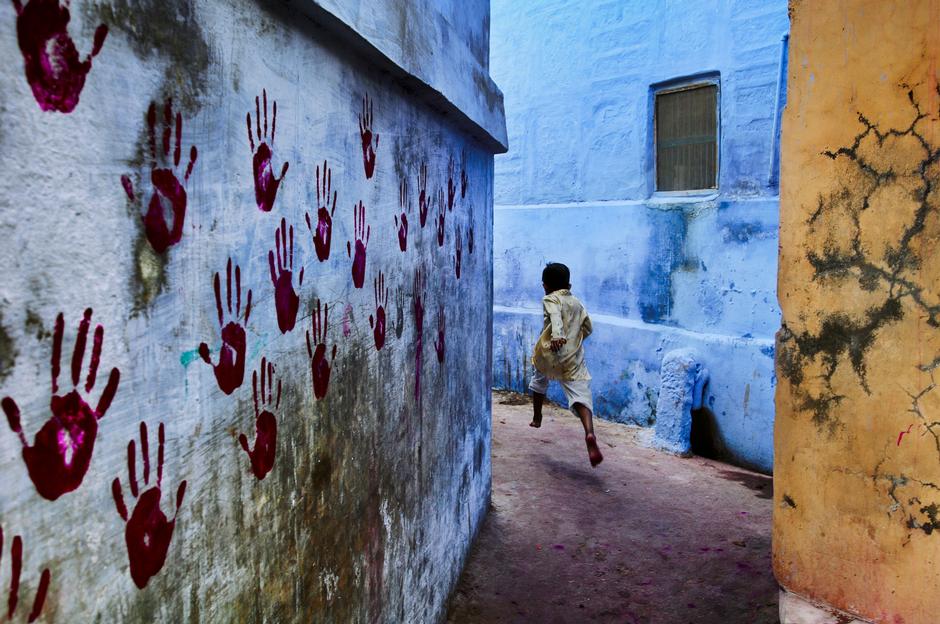 Steve McCurry "India" 2007, mangnumphotos.com. This picture shows emphasis with the use of the red hands on the wall because they draw our attention.  Joel Meyerowitz "Provincetown" 1976, howardgreenberg.com. Harmony is achieved in this photograph by the use of the pinkish background/theme throughout the picture. 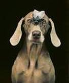 William Wegman "The Fly" 2010, panopticongallery.com. This picture shows variety because of the fly on the dogs nose which strengthens the individuality of the picture. 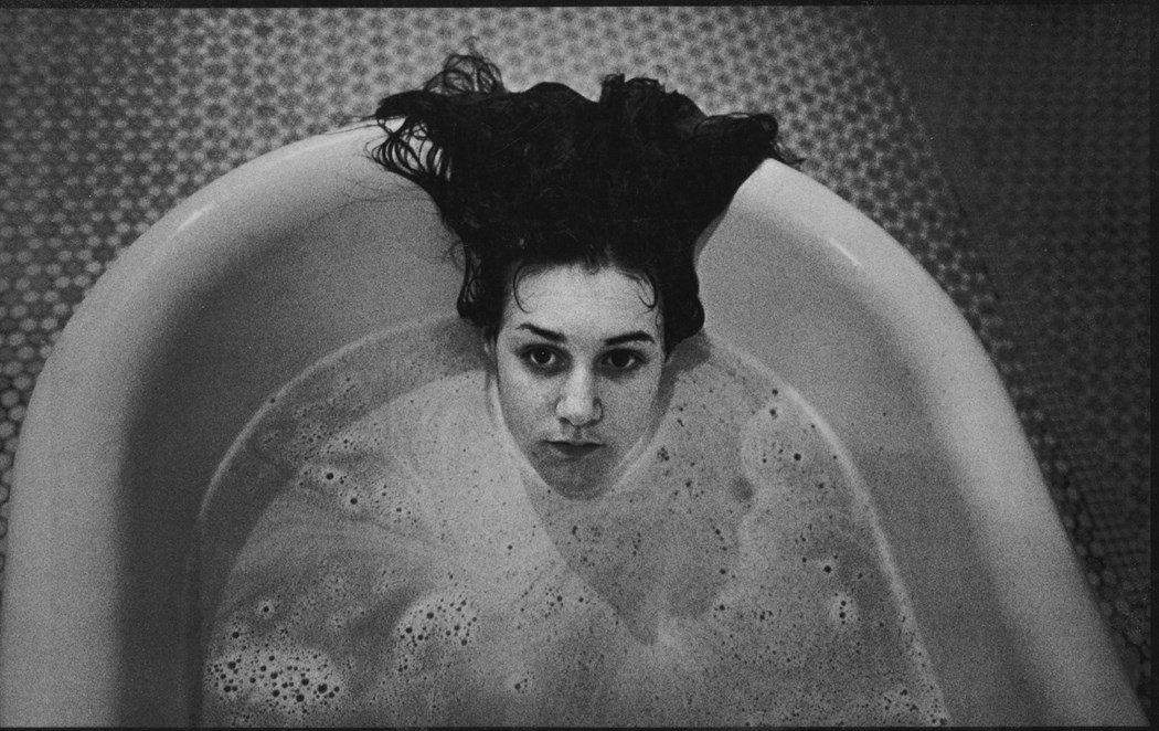 Mary Ellen Mark "Ward 81" 1976, anothermag.com. This picture achieves the sense of oneness through the woman in the bathtub being surrounded by water. 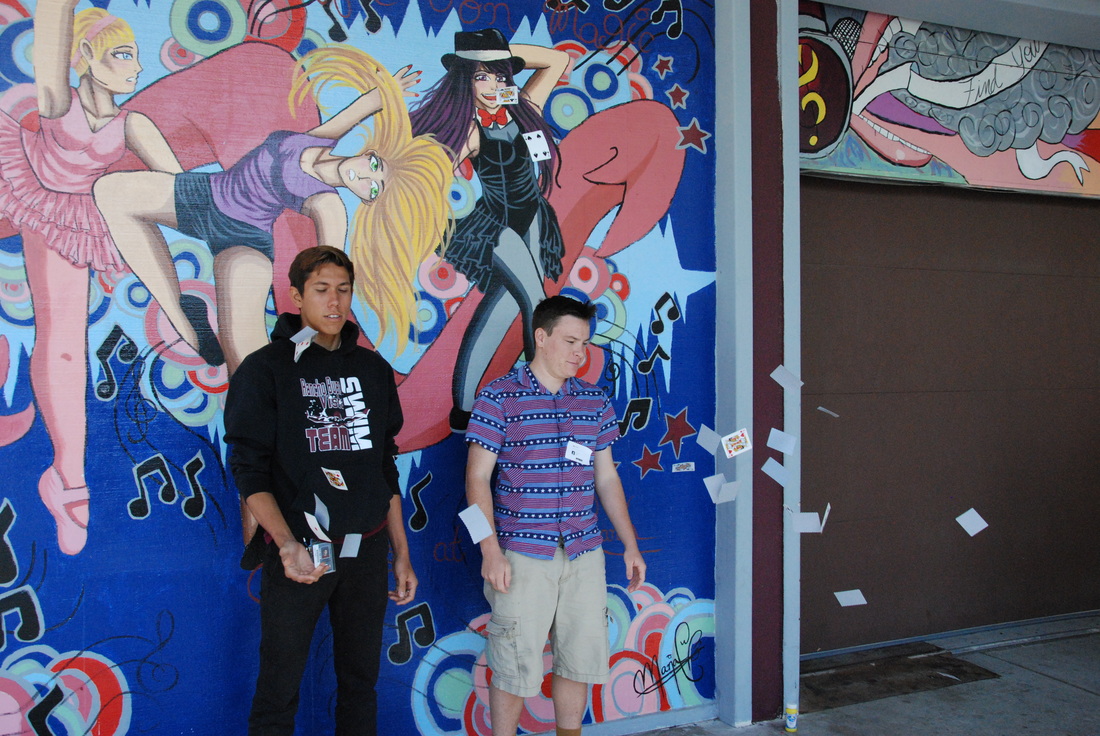 Shutter Speed 1/1000 of a second, Aperture f/6.7, ISO 1600 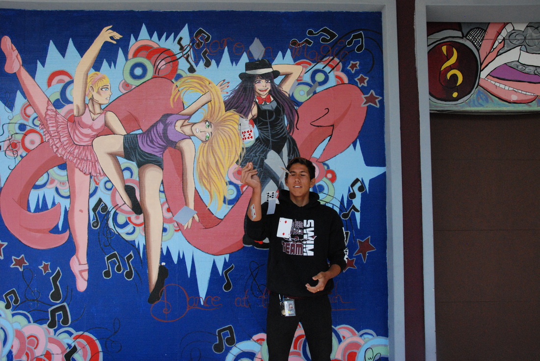 Shutter Speed 1/1000 of a second, Aperture f/8, ISO 1600 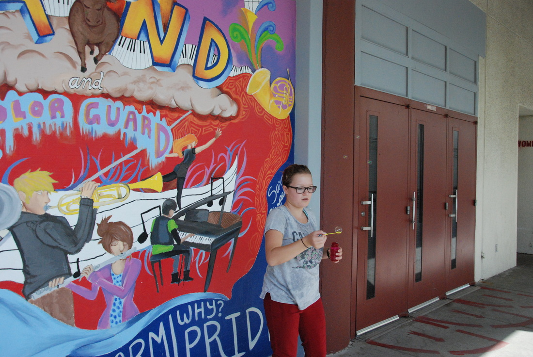 Shutter Speed 1/1000 of a second, Aperture f/6.7, ISO 1600  Shutter Speed 1/1000 of a second, Aperture f/6.7, ISO 1600  Shutter Speed 1/1000 of a second, Aperture f/11, ISO 1600 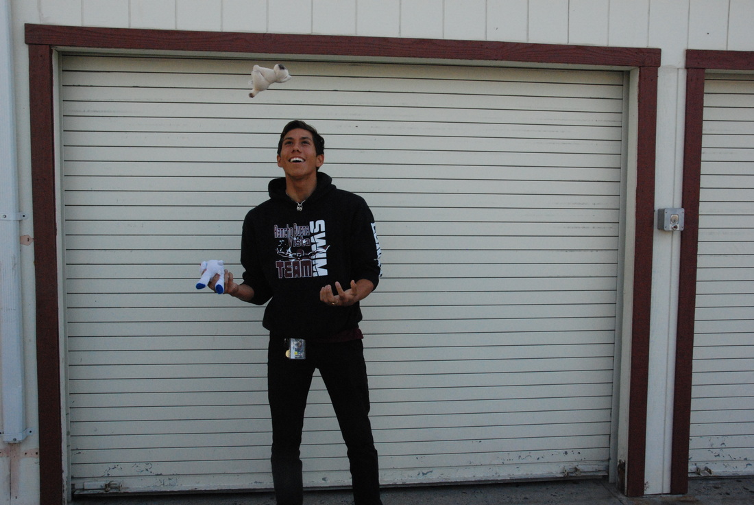 Shutter Speed 1/1000 of a second, Aperture f/11, ISO 1600  Shutter Speed 1/1000 of a second, Aperture f/11, ISO 1600  Shutter Speed 1/1000 of a second, Aperture f/6.7, ISO 1600 1) When we took the pictures the camera was set on 1/1000 of a second shutter speed and the ISO was 1600.
2) The only struggle I had with taking the pictures was the timing of the action which was pretty easily fixed. 3) What I learned about shutter speed is that you can take good quality picture of something in motion, you can basically take an instant moment in time from that series of motions/movement being done, and finally the light meter can tell you if there's too much or too little ambient light. 4) You can use fast shutter speed to freeze action and slow shutter speed to introduce blur into the image. 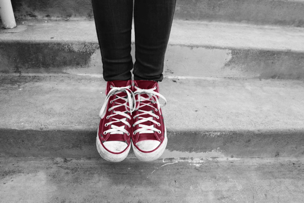 The purpose of this image is to show self respect by isolating a specific item or idea that will be highlighted in red in a black & white image. The red is supposed to make the item standout and get a clear message across to the audience. Basically everything that’s in black & white is just the background and the red is the significance part of the picture. For example, a picture is taken of someone walking across and the highlighted item is his or her binder, the meaning of self respect is the binder because it promotes education and going to school.
The photo that I used was the one with the red shoes. The reason why I chose this picture is because I love fashion and more specifically I love shoes. In order to respect yourself I believe you need to look the part because if you look good, you feel confident and when you feel confident, you portray your true self. So in conclusion, I want people to care about the way they look because first impressions do have a significant impact on others and if you dress up with baggy clothes and oversized shoes I’m pretty sure you’re not showcasing your best self.  Shutter Speed 8 seconds, Aperture f/5.6, ISO 100 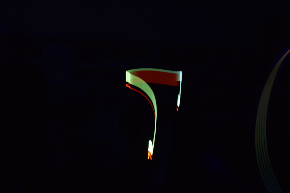 Shutter Speed 8 seconds, Aperture f/5.6, ISO 100  Shutter Speed 8 seconds, Aperture f/5.6, ISO 100 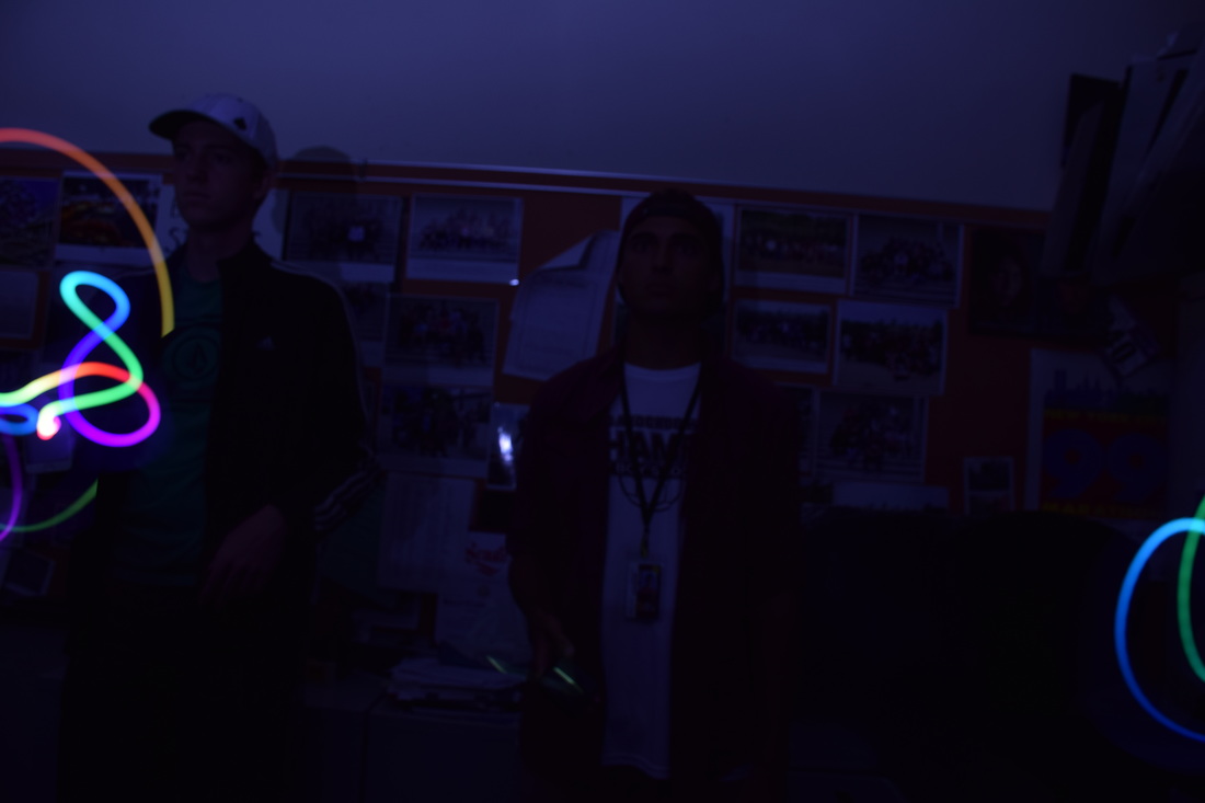 Shutter Speed 8 seconds, Aperture f/5.6, ISO 100 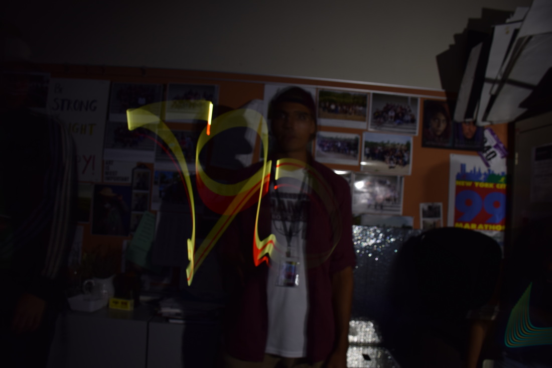 Shutter Speed 8 seconds, Aperture f/5.6, ISO 100  Shutter Speed 8 seconds, Aperture f/5.6, ISO 100 1) We took these pictures on a tripod in a completely dark, black out room in which we set the camera into manual mode so that we could manually change the shutter speeds. Then my partner would just simply press the picture button and I would use an app called Dr. Light to create my illustration.
2) The biggest struggle I had was creating my illustration because it would never come out the way I wanted. 3) The 3 coolest things I learned from light painting was that you need a good app in order to make a cool picture. Then adding a flash makes you appear in the background which makes the image look really cool! Lastly, you can make the lights on your phone/app flash so you can separate letters and characters. 4) You can create really visually stimulating images that can attract an audience easily. |
AuthorHi, my name is Enzo Borghetto and I'm a senior at Rancho Buena Vista High School. Archives
June 2017
Categories |
 RSS Feed
